Portraiture
Portraiture is photographs which contain people. Traditionally portraits are just head and shoulders, but modern photography has evolved and contains interesting props. I don't like portraits particularly, I like more architectural photography because it's more interesting, i like the variety of architecture and the history behind it, and the stories it tells. I am interested to learn more about portraiture and understand how to take an captivating portrait.
The first known photograph
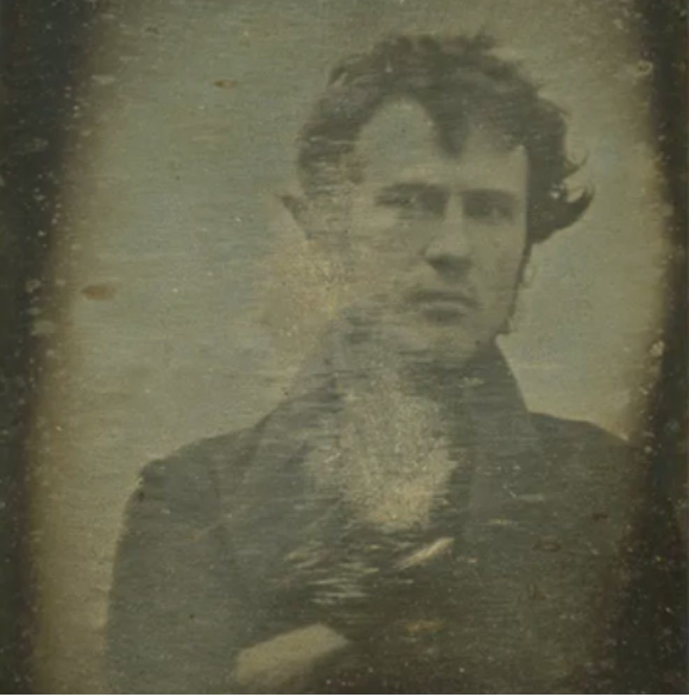
Robert Cornelius
1839
|

Hippolyte Bayard
1840
|
The similarities between the photos are they are both one of the the first portraits to be taken on a box camera and they are both of men .However the differences are that they were taken at different times / events . Their is a 1 year difference between when the two images were taken .They 1st one was taken as a selfie in October 1839 and the second one is taken by a different photographer.
The First Portrait i saw
'The first time i saw a portrait was when I was 4 or 5 years old it was a picture of a woman with dark coloured clothes in a bright coloured background. The portrait was a painting of the head and shoulders. The colours in the background were quite bright, it was the walls of the inside of a house. They were wearing dark colours, dark brown. The image was presented neatly in a gold frame.
5. The first impressions i had of this portrait was that it was the background was bright and the subject was very colourful and interesting.
6. The portrait was a modern painting from the 1990s-2000s, it was quite realistic and made out of traditional paints, now paintings can be made of anything.
7. I dont like portraits particularly, I like more architectural photography because im more interested personally in that subject
Nico Froelich


Nico Froehlich takes portraits that are about people and the everyday environment around them in south London. He frames his images by standing the people in the centre of the photo and in front of a colourful background. the backgrounds in his images are important because they give you an idea of what they are doing also the colours of the background contrast with the people so it makes everything stand out. He photographs the local people of south London when they are doing something so it looks casual. he makes south London look a bit more interesting and brighter.
Nico Froe workshop


We were asked to go around the school and take portraits of people, in the style of Nico Froehlich, with background and people. I didn't enjoy the task as it was quite a challenging environment - in the school there wasn't any interesting material for me to photograph, on the street there is a lot more going on. The barriers for me were the uniformity of the clothes, everybody was in the same colours so it wasn't very visually engaging. If i were to do this again, i would go to somewhere busy like a shopping centre or central London where people are wearing more interesting and varied clothing and doing different things.
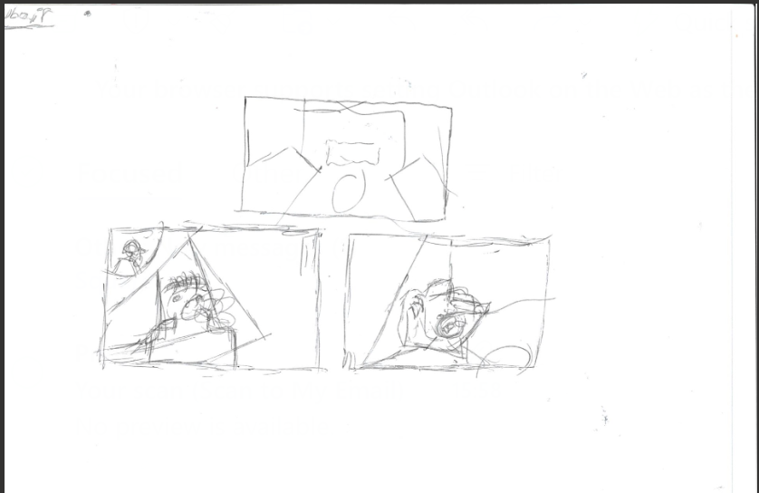
Photo inspired by Nico Froelich


These are my Nico Froe inspired photos, all taken in the local area near my house. I took photos of people who are familiar to me, except the police officers who I asked separately. I didn't find this difficult and was okay with practicing Nico Froes advice about being respectful and friendly. My favourite is the photo of the boy on the roof kicking the football, it was good timing and the football flying past made it an interestingly framed photo. I also noticed the lines in the sky left from the aeroplanes are leading the viewers eye to the boy, making him the centre of the photo. It makes him seem powerful. My least favourite is the photo of the shopkeeper, I feel like it doesn't fit the rest of the photo set as it doesn't bring in any outside elements, and doesnt include sunlight which is my preferred type of light. I didn't enjoy the process as i found it really hard to produce photos I liked in the time, it was challenging to get the right balance between having an interesting subject and interesting, contrasting background.
Tyler Mitchell


Tyler Mitchell is an American photographer who takes photos mostly related to magazine covers , fashion , culture and celebrities. He focuses his work on black models and celebrities who live in America and their experiences. He usually uses props and backgrounds to express the emotion , style of the photos that he takes
Photos in the style of Tyler mitchell


I took In this lesson we took pictures in the style of Tyler Mitchell. His photographs are typically very colourful, he uses unusual props to create interesting shapes. I decided to use the table tennis table and the staircase in the outdoor environment, and experimented with different framing of the staircase to create interesting lines and composition.
In my opinion the first one was the best because everything stands out, because of the colourful background, however this isn't using creative angles like Tyler Mitchell. My least favourite photo is in the staircase, I feel like the light is coming from the wrong angle (from the back) I explored more Tyler Mitchell's style of angles in the third one, i took from the platform to get a good angle from above. For the forth one I took the photo on the platform by lowering the camera and taking the picture from around knee height so i could fit in some of the sky and clouds. To improve i think that I would vary the environment to find more interesting places, and use more unusual props like a bag.
In my opinion the first one was the best because everything stands out, because of the colourful background, however this isn't using creative angles like Tyler Mitchell. My least favourite photo is in the staircase, I feel like the light is coming from the wrong angle (from the back) I explored more Tyler Mitchell's style of angles in the third one, i took from the platform to get a good angle from above. For the forth one I took the photo on the platform by lowering the camera and taking the picture from around knee height so i could fit in some of the sky and clouds. To improve i think that I would vary the environment to find more interesting places, and use more unusual props like a bag.
Photography trip photos


Reflective Portraits


In this lesson we looked at different types of self portraits capturing people through reflective surfaces. i like the 4th photo the best because it has a good reflection of the light and the green and creates a glitching effect.
However the first one i dislike the most because it doesn't reflect and its grey, dull and blurry .this problem could be improved by taking the picture in a more lit up area to sop the blurriness .
However the first one i dislike the most because it doesn't reflect and its grey, dull and blurry .this problem could be improved by taking the picture in a more lit up area to sop the blurriness .
Elements of a portrait


I took a series of portraits, a police mugshot, a self portrait, a passport photo and a family photo. In the police mugshot and the passport photo, the facial expression has to be straight and neutral, and the background plain, to show clearly the features of the face because the picture has to be identifiable and simple. In the family photo, they are all sitting in a row, with the same pose, like traditional family photo. They are more natural, relaxed, like an organic family photo. I could improve these by zooming out slightly on the passport and mugshot pictures and turning on the flash in some of the pictures .
recreating paintings


www: The images both have good lighting. They are both similar to the original images but are slightly different because of equipment and the background . (they have been slightly changed )
EBI: If i improve the background in the first image by having a plain black background so that the main part of the image stands out
EBI: If i improve the background in the first image by having a plain black background so that the main part of the image stands out
Improved photos

I have improved the photo by remaking it in front of the backdrop .
i have also decided to reposition the mirror and experiment with the lighting and clothing
i have made the image a bit less brighter by making only half of the image lighted and the other half not lighted as much because the window is on the left hand side. I chose this because the other image was too dark so this highlights the faces and thing in the photo a lot more.
Cyanotypes
Man Ray


Luigi Veronesi


Luigi Veronesi is an Italian photographer he has made photograms , painting and he has his own book called flowers
his photography is based on things like photograms from around the twentieth century
his most famous piece is called 'construction ' and was very famous in 1938
his photography is based on things like photograms from around the twentieth century
his most famous piece is called 'construction ' and was very famous in 1938
Samuel Fosso (portraiture )


The first photos genre is Portrait the subject/ foreground of the photo is himself on a chair dressed colourfully .IN the background there is a wallpaper on the wall and ground
Portraiture


rankin destroy


Rankin destroy is a project by Ian Rankin which focuses on making a portrait then destroying and mixing it with others to make another photo. He mostly did this by taking a series of pictures drawing on them , cutting them up and putting the pieces back together in different orders on a simple plane background. the best example of this is is the third one above this is because he has used certain parts of the images and put them together to make a final photo.


Four experiments


I think for the first task on Photopea the photos are effective because i have used different patterns and ways to change the image from the original to this. The photo(s) don't work so well because all the pictures are similar. I think that other people would agree that they all look similar because i have used the same portrait 4 times. I think the thing worth remembering about these photographs is what i done and how i done it so that i can reattempt in the future and improve it.

This is my photocopy colour experiment, I used my self portrait as the base material. I cut it up randomly and intuitively, then rearranged it onto the photocopying bed. I tried to plan out the shapes, and chose purple and yellow as i thought they would complement each other, and make a bright outcome. I think the purple was not as bright as i was expecting, therefore i'm not 100% happy with the colours, next time i think i would pick red and green as they would have more depth. The process is more interesting than taking a normal photo.

For my photogram i used the same self portrait, putting my negative on the enlarger and using string to distort my portrait. I like the string, it was versatile and i could shape it the way i liked. next time i think i would make more shapes with the string and distort my portrait more, experimenting with what shapes i could cut out. The darkroom process is new for me and I was getting used to using everything, so i just did a very simple experiment.
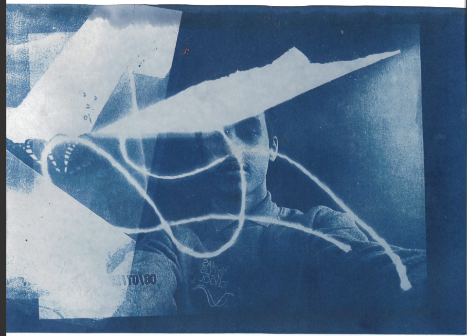
My cyanotype - I used my acetate negative and pieces of scrap fabrics to skew the perspective and make it into a more creative self portrait. I like this outcome the best out of my experiments so far, I think i did a good job selecting different textures and creating a different, more layered image. Next time I think i would change the position of the string to make it more intricate, and add more materials - the cardboard is too opaque and is blocking out a lot of the blue, which i like as it is more interesting than black and white. I liked the whole process of this, and the outcome, I think i would use some of my more refined self portraits from my later photoshoots, and use a more intricate texture. I like the lace-like texture in the left hand corner, an think that i would try and find something like that to add.
Homework response to Lee Friedlander


The 30 self Portraits I took were taken in a similar style to Lee Friedlander's. The photos were inspired by his environmental portraiture and a few other styles . I took the portraits mostly outside in my local area to achieve the environmental effect I done this by having trees, buildings and the sky mostly in the back ground and myself in the foreground for example images six , fourteen and nine. I took some images in the blue hour to allow me to blur/obscure my face and make the back ground and my clothes stand out I have also done this with a torch and light bulb... This is similar to Lee Friedlander's work because he also used natural and artificial light in his images as well as buildings trees and props. To improve my images in the future I could take more in the daytime and in slightly more busier locations so that more is going on in the backgrounds and to make them more interesting i could also use more props and reflective surfaces to make them even better and similar to the original.
Ziqianqian


In the second image above ziqiaqian uses mirrors and fruit in the portrait these two features make the photo both a portrait and a still life photo. also she covers her face in all of the photos this is called a abstract portrait because she is obscuring her face with different objects . she uses props in her photos including grapefruit and a mirror which she has chosen because they are both the same shape, she uses a dull background to make the grapefruit look bright and to make the colours contrast . elements of this picture that i like are the way that the composition is interesting and unusual. however i would improve this image by adding more colour to it.
self portraits inspired by Ziqianqian


For the homework i took 30 self portraits inspired by Ziqianqian. I done this by taking the photos in mirrors and using basic everyday objects such as a balloon, flowers and a lightbulb to make them similar to the artists photos. i used two mirrors both of different sizes. I found it really difficult to think of poses and ways I could interact with the props, I think the way she takes the photos is simple but really considered. The image I thought was the most successful was the last row third across, due to the reflection on the mirror. Because it is a mirror reflecting a mirror, it has an endless effect which makes the photo a lot more interesting. My least successful photos were the ones which I didn't use the props in an interesting way, and I was too obvious and straight forward in taking as a self portrait, and also I feel like they are all quite visually similar as they are taken in one room. I think it would be a good idea to use different backgrounds, a brighter wall around my house to make the colours contrast a bit more.
Refined - Using a mirror


These photos I took in school, using one mirror and a dslr camera. I didn't have many ideas for this shoot, I was using limited props and I didnt know how to turn off the flash on the camera. However the flash distorted my face and figure, making it blurred, and I liked the effect when I put my hand in front of the flash, creating a different colour.
20 Self Portraits homework


For this homework i took 20 selfportaits in different styles that i have learned and used in the past few lessons .
i took these photos at home and i used a desk lamp for the lighting, which made my photos a lot brighter and cleaner. I used varied props from around my house such as calculator, cushion, curtains, a ring and mirrors. I also used my hands and the objects to obscure my face. I kept the colours very simple to give the series a more put together feel white and grey walls. yellow hoodie and the neutral colours of my hair. Overall I liked better the first half of the photos, they have three colours, are minimal showing small parts of my features, I think the framing is more interesting than most of my self portraits, it is selective and shows parts of my face/shoulders that normally isn't zoomed in upon. Some of the photos are too dark for my liking, i think this is because i didn't use the desk lamp, and took them at night, it makes it colourless and dull. I think some of these are a bit more refined than my last ones as I used more creative ways to obscure the photo. For some, I created more interest by editing them and putting a squiggle over the important features of the face - the eyes, mouth, nose, all over as well.
i took these photos at home and i used a desk lamp for the lighting, which made my photos a lot brighter and cleaner. I used varied props from around my house such as calculator, cushion, curtains, a ring and mirrors. I also used my hands and the objects to obscure my face. I kept the colours very simple to give the series a more put together feel white and grey walls. yellow hoodie and the neutral colours of my hair. Overall I liked better the first half of the photos, they have three colours, are minimal showing small parts of my features, I think the framing is more interesting than most of my self portraits, it is selective and shows parts of my face/shoulders that normally isn't zoomed in upon. Some of the photos are too dark for my liking, i think this is because i didn't use the desk lamp, and took them at night, it makes it colourless and dull. I think some of these are a bit more refined than my last ones as I used more creative ways to obscure the photo. For some, I created more interest by editing them and putting a squiggle over the important features of the face - the eyes, mouth, nose, all over as well.